Website
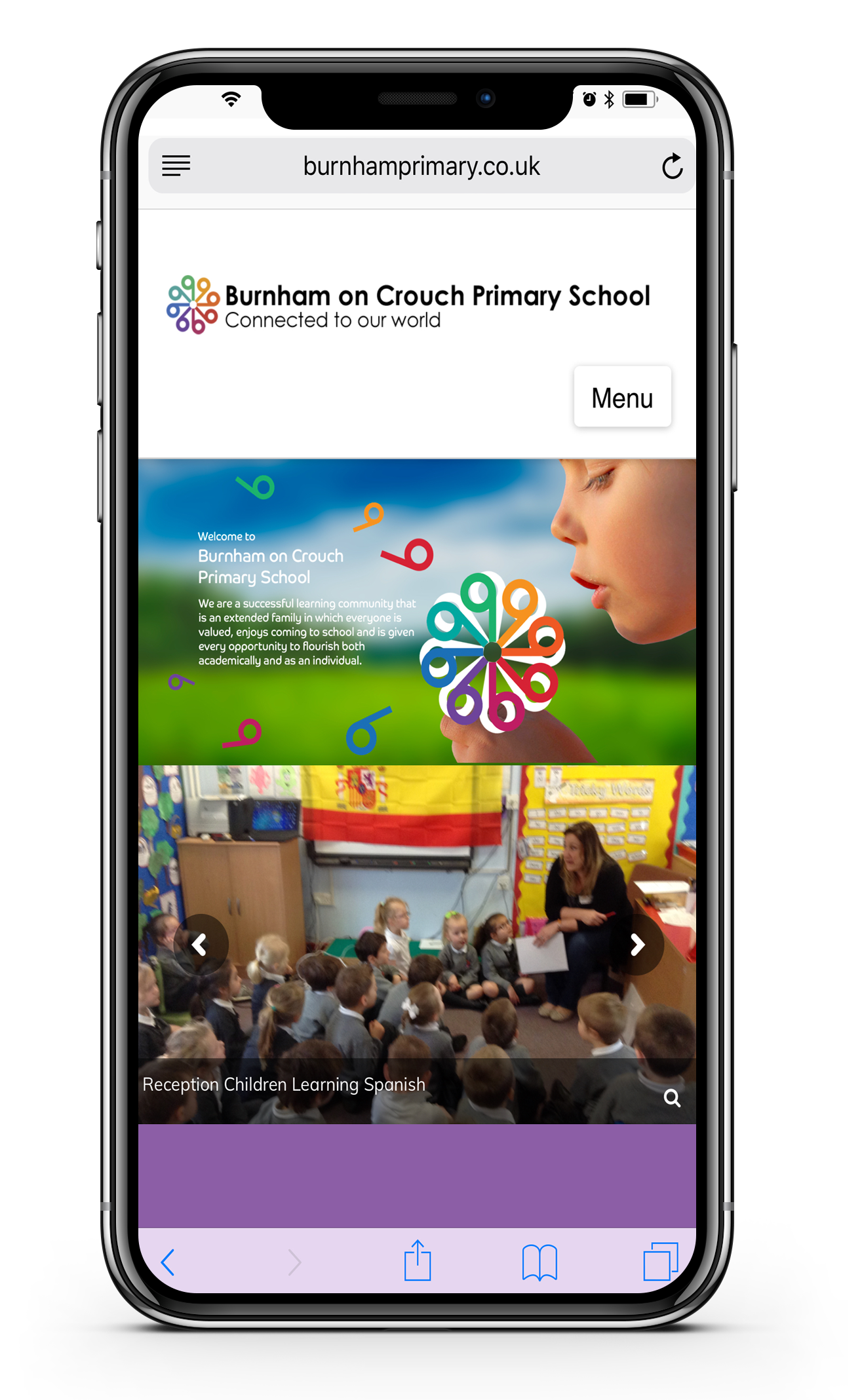
Our website has been designed to use on your computer, smart phone or tablet.
The website is built using special code to be responsive and to scale to the many difference devices and screen sizes we use today. This allows you to view the content we publish to the website in a clean and uncluttered format. For example, when viewing the website on your smart phone, the layout of the homepage will adjust to show the headlines in a larger area so you can see these important messages without the need to zoom or enlarge.
Follow the instructions below and you can even save the website on your iPhone or Android device home screen as a Web App.
Android
Launch Chrome for Android and open www.burnhamprimary.co.uk to pin to your home screen. Tap the menu button and tap Add to homescreen. You’ll be able to enter a name for the shortcut and then Chrome will add it to your home screen.
iOS
Click the Share icon on the browser’s toolbar — that’s the rectangle with an arrow pointing upward. It’s on the bar at the top of the screen on an iPad, and on the bar at the bottom of the screen on an iPhone or iPod Touch. Tap the Add to Home Screen icon in the Share menu. You’ll be prompted to name the shortcut before tapping the Add button.